Yesterday was a half day at my school so I decided to do something small but meaningful in each of my classes. At the moment my Algebra 1 students are embarking on my Data Representation unit so we are looking at many different graphs/charts/plots and asking questions about them to see if interpretations are valid. At the same time, I am having them create their own plots by gathering data from their classmates (i.e. asking questions with numerical answers). It's a great time and often spurs a lot of conversation.
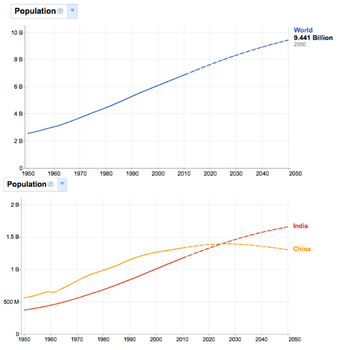
I started by showing them these two graphs using Google's new Public Data Explorer. I just wanted to find out what they could ask/tell/explain without me prompting anything. I got some fantastic results, summarized here:
- The x-axis (unlabeled) is the year.
- The dotted line is an estimate for the future.
- Why does the Chine line dip? Maybe there is some epidemic/war/famine/birth decline.
- Time vs. population is a direct relationship.
- What about the baby boom? How does that affect this (disclaimer: I explained what it was and they were fascinated to find out there is a connection between history and math)


 RSS Feed
